Stripe Homepage
Understanding how Stripe turns a complex financial infrastructure platform into a clear, persuasive website experience.
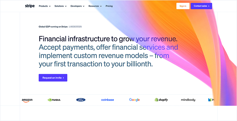
Overview
Stripe provides financial infrastructure for businesses ranging from early-stage startups to global enterprises.
But Stripe has a difficult website communication problem. Its audience isn't one type of user. The website needs to communicate with:
Each audience has different needs, concerns, and levels of technical understanding. So instead of studying Stripe purely from a visual-design perspective, I reverse-engineered its homepage to understand: How does Stripe communicate a complex product to multiple audiences while guiding them toward conversion
 Stripe speaks to multiple audiences on one page
The Core Challenge
Stripe isn't selling one simple product. Its ecosystem includes payments, billing, financial infrastructure, embedded finance, developer APIs, integrations, enterprise services, and more.
That creates a communication challenge:
"How do you explain a large ecosystem without overwhelming the visitor"
I studied the homepage looking specifically at: Information hierarchy → Audience segmentation → Storytelling → Trust → Social proof → Objection handling → CTAs → Conversion.
My Core Finding
My biggest finding was that Stripe's homepage isn't simply a collection of product sections. It behaves more like a decision journey.
The page progressively answers questions a potential customer may have:
What is Stripe
What can it do for my business
Can I trust it
Does a company like mine use it
Can it handle my scale
Will it work with my existing systems
How difficult is implementation
How can I get started
This turns a technically complex platform into a more understandable narrative.
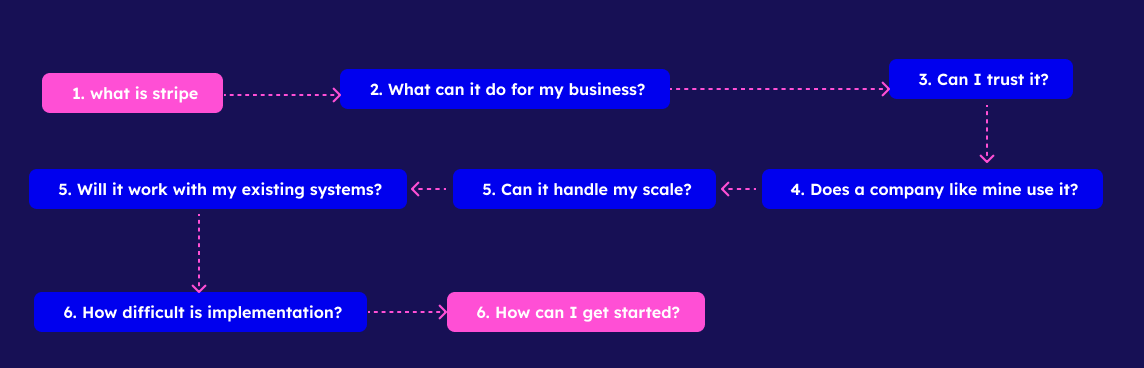 The progressive decision journey on Stripe's homepage
Establishing Stripe's Position
"The backbone of global commerce"
Stripe's positioning statement
Stripe uses a strong positioning statement rather than immediately explaining individual features. The message positions Stripe as infrastructure behind digital commerce, rather than simply another payment processor.
But Stripe doesn't leave this as an unsupported marketing claim. It immediately follows the statement with measurable evidence:
currencies and payment methods supported
→ Global reachin payments volume processed in 2025
→ Scalehistorical uptime for Stripe services
→ Reliabilityactive subscriptions managed on Stripe Billing
→ AdoptionDesign pattern
Claim → Quantifiable proof → Visual reinforcement
My takeaway: Instead of telling users "We're global, reliable and scalable," Stripe provides evidence that allows users to reach that conclusion themselves.
Moving From Scale to Enterprise Trust
After establishing infrastructure credibility, Stripe moves toward enterprise customers.
"Powering businesses of all sizes."
The page communicates that Stripe isn't limited to startups.
of Fortune 100 companies have used Stripe to grow their businesses.
This directly addresses an enterprise concern: "Do organizations at our scale actually use this"
 Enterprise messaging and Fortune 100 social proof
Turning Claims Into Customer Evidence
Stripe then introduces recognizable customer stories. Instead of simply displaying company logos, Stripe connects companies with specific outcomes.
Hertz
Unifies commerce with Stripe
URBN
Powers multi-brand retail
Instacart
Scales grocery delivery payments
Le Monde
Manages digital subscriptions
Design pattern
Customer → Problem/Outcome → Stripe
My takeaway: A customer logo tells me who uses the product. A customer outcome tells me why they use it.
 Customer logos paired with specific business outcomes
Reducing Enterprise Adoption Risk
After convincing the visitor that large organizations use Stripe, another question naturally appears: "How difficult will implementation be"
Stripe addresses this with:
Professional services
Guidance for implementation, complex integrations and migrations.
Stripe-certified experts
External partners capable of integrating and deploying Stripe solutions.
Support plans
Ongoing technical assistance after implementation.
The message changes from "Our technology is powerful" to "You won't have to implement it alone."
My takeaway: Good product storytelling doesn't only communicate benefits. It identifies what might prevent the user from adopting the product and addresses those concerns.
 Stripe reduces adoption risk with implementation support
Changing the Story for Startups
Stripe then changes audiences.
"Build a foundation for your startup that enables faster growth."
Enterprise users care about:
Startup users have different priorities:
Stripe therefore changes the value proposition while keeping the same underlying product ecosystem. The section also introduces social proof around modern high-growth companies:
The message becomes: "Companies building what's next are building on Stripe."
My takeaway: Same product. Different audience. Different motivation. Different story.
 Startup-specific value proposition and aspirational social proof
SaaS Platforms, Developers & Technical Proof
"Make your SaaS platform a complete financial operating system."
Stripe communicates: use our infrastructure to add financial capabilities to your own product.
Rather than explaining embedded finance through a long paragraph, Stripe demonstrates capabilities — Payments, Payouts, Financing, Notifications — inside a SaaS-style interface. Show the product in the context where the user would actually experience it.
"Reliable, extensible infrastructure for every stack."
The page shifts toward technical decision-makers.
A developer or CTO evaluating Stripe may have a different concern: "Will this work with the systems we already have" Stripe addresses this through APIs, SDKs, partner applications, pre-built integrations, developer documentation, and GitHub.
The message is essentially: "Stripe adapts to your architecture rather than forcing your architecture to adapt to Stripe."
"Scale with confidence."
Stripe doesn't rely on adjectives like fast, powerful or scalable. It provides numbers.
API requests per day
API requests per second
transactions per minute
These metrics turn an abstract claim about scalability into something measurable. The higher the perceived risk of a decision, the more important specific evidence becomes.
Once Stripe has established technical confidence, the page moves toward implementation with three integration paths:
No-code
For users who don't want to develop an integration. Use existing Stripe functionality.
Pre-integrated platforms
For businesses already operating through other platforms.
Custom integration
SDKs, APIs, MCP, developer tools for full flexibility.
UX principle: One goal doesn't require one path. Stripe allows users to choose based on their technical capability and business requirements.
 Stripe demonstrates product capabilities in context for developers and SaaS platforms
The Storytelling Architecture I Found
When I mapped the homepage, I found this underlying structure:
This is what Stripe represents.
This is what Stripe enables.
Here is our scale and reliability.
Enterprise / Startup / Platform / Developer
Here's why Stripe matters specifically to you.
Here are companies like you already using it.
Support / reliability / integrations / scalability.
Here are different ways to implement Stripe.
Sales / Pricing / Start building.
 The underlying storytelling architecture of Stripe's homepage
A Pattern Repeated Across the Homepage
One of the strongest patterns I observed was:
Claim → Proof → Action
Stripe frequently makes a claim, then provides proof, then gives the visitor a path forward:
"Scale with confidence."
500m+ API requests/day
A path forward for the visitor.
This pattern appears repeatedly in different forms throughout the homepage. It prevents the website from becoming a collection of unsupported marketing statements.
 The recurring Claim → Proof → Action pattern
Audience-Based Storytelling
Another important finding was how Stripe changes its message depending on the audience. Stripe doesn't attempt to convince every user with the same argument.
| Audience | Primary concern | Stripe's response |
|---|---|---|
| Enterprise | Reliability & complexity | Scale, Fortune 100 proof, services |
| Startup | Speed & growth | Easy infrastructure, startup examples |
| SaaS Platform | Product expansion | Embedded financial capabilities |
| Developer | Flexibility & implementation | APIs, SDKs, docs, GitHub |
| Technical leadership | Performance | Infrastructure metrics |
How This Changed My Approach to Product Design
This study changed how I think about website structure. Before deciding what section should come next, I can ask:
"What question is the user likely asking at this point"
If I just introduced a service
→ Why should I care
After explaining the benefit
→ Can I trust you
After building trust
→ Does this work for someone like me
After showing proof
→ How does it work
After explaining how it works
→ How do I start
This changes website design from "What sections should I add" to "What does the user need to understand next"
 A new framework for structuring product pages based on user questions
What Stripe Does Well & What I Learned
The strongest aspects of the experience I identified:
Different users receive different value propositions.
Important claims are supported by numbers or customer examples.
Complex information isn't presented all at once.
CTAs change depending on what the user is currently evaluating.
Product visuals explain concepts that would otherwise require paragraphs.
Anticipates questions about scale, implementation, reliability, support and pricing.
Customers are connected with what they achieved rather than appearing only as logos.
The biggest lessons:
Information sequencing matters more than visual polish. A strong homepage doesn't need to explain everything immediately. It needs to answer the right question at the right moment.
Progressive disclosure reduces cognitive load. Stripe moves visitors from Understanding → Relevance → Trust → Proof → Confidence → Action.
Evidence beats adjectives. Instead of saying "we're global, reliable and scalable," Stripe provides numbers that allow users to reach that conclusion themselves.
Different audiences need different stories. Enterprise cares about reliability. Startups care about speed. Developers care about flexibility. Same product, different narrative.
Final Takeaway
Stripe's homepage doesn't simply present products. It progressively removes the reasons a user might hesitate to adopt them.
This reverse engineering study gave me a framework for thinking about website structure — not as a collection of sections, but as a sequence of answers to the questions users are asking at each stage of their decision journey.
Thank you for reading.